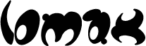
Center of Gravity, created by Kate Gooridge, is a free groovy display font with dramatic shifts between broad black shapes and hairline strokes. Its letters mix rounded, architectural curves with abrupt angles and open sections, producing an eccentric silhouette that changes from character to character.
Packaging is a strong setting for this lettering, especially on fashion, cosmetics, or art-led products that favor experimental typography. These sculptural forms suit music posters and editorial covers. Across these uses, the letters can function as graphic shapes as much as text.
--
Alignment is based on each letterform’s center of gravity. Each letter is composed of regular positive and negative shapes to enable this calculation, and the letterforms are aligned according to their centers of gravity rather than the baseline and x-height.