Charpentier Classicistique Reduced Semibold
TrueTypeДля личного пользования
CharpentierClassicRed_Med.ttf
Теги
Примечание автора
Charpentier Classicistique Reduced Semibold font is an unconventional classicistic Roman typeface designed by Ingo Zimmermann of ingoFonts.
This Roman typeface has a livelier effect than is typical of the epoch of classicistic style.
In the lower case letters, an echo of the smoother forms of historically early scripts is identifiable. Typical of a classicistic Roman typeface are the emphasized and clear contrast in the weight of the strokes, the fine serifs and the accentuation of the vertical bold stem. Charpentier Classicistique is pleasantly legible. Its effect is much less harsh than other classicistic fonts. The pointed forms of M and N are uncommon.
At 30, the italic version of Charpentier Classicistique is unusually strongly slanted. The italic lower case letters refer, in part, to English handwriting, which also falls under classicism. Especially the curves show forms influenced by writing.
Charpentier Classicistique is available in four font weights:
regular, semibold, bold and black.
Thanks to OpenType and Unicode, Charpentier Classicistique Standard and Charpentier Classicistique Pro support all European languages including Turkish, Greek and Russian. Both versions include lots of ligatures, also discretional ones, as well as figures for normal setting and tabular figures with constant width and cap-height figures.
The font downloadable here is a reduced version (without punctuation, ligatures, numbers etc.). A commercial version of this font (with all features) is available at www.ingofonts.com.
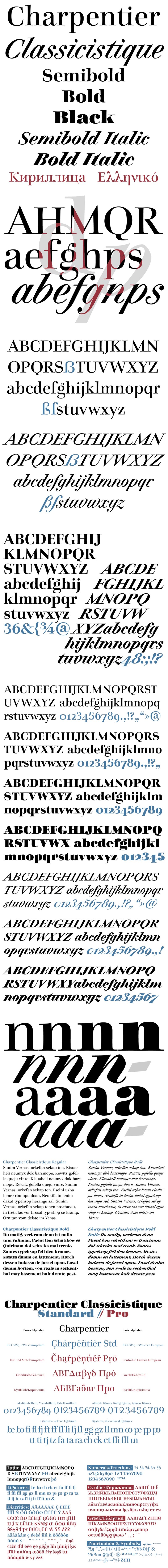
Таблица символов
Для просмотра различных таблиц символов, содержащихся в этом шрифте, пожалуйста, используйте раскрывающееся меню.

Основная информация о шрифте
О авторских правах
Copyright (c) 2015 by Ingo Zimmermann ingoFonts Augsburg. All rights reserved.
Шрифтовая семья
Charpentier Classicistique Reduced
Шрифтовая подсемья
Semibold
Уникальная подсемейная идентификация
IngoZimmermanningoFontsAugsburg: Charpentier Classicistique Reduced Semibold: 2015
Полное имя шрифта
Charpentier Classicistique Reduced Semibold
Имя настольной версии
Version 1.009
Имя поскрипт шрифта
CharpentierClassicistiqueRed
О торговой марке
Charpentier Classicistique Reduced Semibold is a trademark of Ingo Zimmermann ingoFonts Augsburg.
О производителе
Дизайнер
Описание
Copyright (c) 2015 by Ingo Zimmermann ingoFonts Augsburg. All rights reserved.
Дополнительная информация о шрифте
Поддерживаемые платформы
ПлатформаКодировка
ЮникодЮникод 2.0 и прогрессивная семантика, только Юникод BMP
MacintoshЛатинская
MicrosoftТолько BMP юникод
Детали шрифта
Создан2015-04-03
Просмотр1
Количество глифов53
Единиц на Em1000
Права внедренияBнедрение для стационарной установки
Класс семействаНе квалифицированный
НасыщенностьЖирный
ШиринаСредний (нормальный)
Mac стильКурсивные
НаправлениеГлифы направленные слева направо + нейтральные
УзорPегулярный
ВысотаНе моноширинный
Пакет содержит 7 нижеуказанных шрифта(ов):
CharpentierClassicRed_Med.ttf
CharpentierClassicRed_It.ttf
CharpentierClassicRed_MdIt.ttf
CharpentierClassicRed_Reg.ttf
CharpentierClassicRed_Blk.ttf
CharpentierClassicRed_Bd.ttf
CharpentierClassicRed_BdIt.ttf
CharpentierClassicRed_It.ttf
CharpentierClassicRed_MdIt.ttf
CharpentierClassicRed_Reg.ttf
CharpentierClassicRed_Blk.ttf
CharpentierClassicRed_Bd.ttf
CharpentierClassicRed_BdIt.ttf
Charpentier Classicistique Reduced Italic
TrueTypeДля личного пользования
Charpentier Classicistique Reduced Semibold Italic
TrueTypeДля личного пользования
Charpentier Classicistique Reduced
TrueTypeДля личного пользования
Charpentier Classicistique Reduced Black
TrueTypeДля личного пользования
Charpentier Classicistique Reduced Bold
TrueTypeДля личного пользования
Charpentier Classicistique Reduced Bold Italic
TrueTypeДля личного пользования