Domine
TrueTypeБесплатная
- Ударения (частичные)
- Ударения (полные)
- Евро
Domine-Regular.ttf
Теги
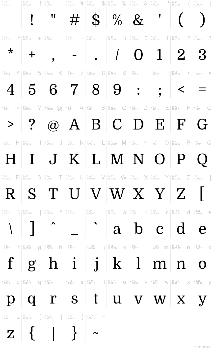
Таблица символов
Для просмотра различных таблиц символов, содержащихся в этом шрифте, пожалуйста, используйте раскрывающееся меню.

Основная информация о шрифте
О авторских правах
Copyright (c) 2012, Pablo Impallari (www.impallari.com|impallari@gmail.com),
Copyright (c) 2012, Rodrigo Fuenzalida (www.rfuenzalida.com|hello@rfuenzalida.com),
Copyright (c) 2012, Brenda Gallo (gbrenda1987@gmail.com), with Reserved Font Name Domine.
Copyright (c) 2012, Rodrigo Fuenzalida (www.rfuenzalida.com|hello@rfuenzalida.com),
Copyright (c) 2012, Brenda Gallo (gbrenda1987@gmail.com), with Reserved Font Name Domine.
Шрифтовая семья
Domine
Шрифтовая подсемья
Regular
Уникальная подсемейная идентификация
PabloImpallari,RodrigoFuenzalida,BrendaGallo: Domine: 2012
Полное имя шрифта
Domine
Имя настольной версии
Version 1.000; ttfautohint (v0.93) -l 8 -r 50 -G 200 -x 14 -w "G"
Имя поскрипт шрифта
Domine-Regular
О торговой марке
Domine is a trademark of Pablo Impallari
О производителе
Дизайнер
Описание
From the very first steps in the design process 'Domine' was designed, tested and optimized for body text on the web.
It shines at 14 and 16 px. And can even be used as small as 11, 12 or 13px.
Harmless to the eyes when reading long texts.
Domine is a perfect choice for newspapers or magazines websites, where text is the main focus.
It's is friendly in appearance because it combines the classic elements of familiar typefaces that have been in use from more than 100 years like Clarendon, Century, Cheltenham and Clearface.
- The rounded letters (b, c, d, e, o, p, q) are a bit squarish on the inside. This feature opens up the counters for better rendering and also make it look a bit more up-to-date than the classic typefaces previously referenced.
- The serifs are a bit shorter than usual. Another feature that improves the rendering by allowing more "air" between each letter pair.
- The joins of the stems to the branches in letters like h, m, n are deep enough to prevent dark spots, also improving legibility at small sizes.
- The friendly lowercase 'a', with the curve starting from the bottom of the stem, is reminiscent of Cheltenham and Clearface. That soft curve is also echoed in the curves of the f, j, n, m and r.
- The spacing is also optimized for body text on the web, clearly more open than that of typefaces made for print or for headlines.
Дополнительная информация о шрифте
Поддерживаемые платформы
ПлатформаКодировка
ЮникодЮникод 2.0 и прогрессивная семантика, только Юникод BMP
MacintoshЛатинская
MicrosoftТолько BMP юникод
Детали шрифта
Создан2012-11-28
Просмотр1
Количество глифов437
Единиц на Em1000
Права внедренияBнедрение для стационарной установки
Класс семействаСвободные засечки
НасыщенностьСредний (нормалный)
ШиринаСредний (нормальный)
Mac стильЖирные
НаправлениеГлифы направленные слева направо + нейтральные
УзорPегулярный
ВысотаНе моноширинный
Пакет содержит 2 нижеуказанных шрифта(ов):
Domine-Regular.ttf
Domine-Bold.ttf
Domine-Bold.ttf
Domine Bold
TrueTypeБесплатная