Kaput Black
TrueTypeДля личного пользования
- Ударения (частичные)
- Евро
Kaput-Black-FFP.ttf
Теги
Примечание автора
Kaput Black, a unique, heavy uppercase typeface, is here to create great titles and high-impact visual communication.
Kaput Black is designed with a perfect balance between strength and sophistication, it is bold, semi-expanded and spectacularly legible, the thick lines and horns with marked contrasts, which not only catch the eye, but also provide real harmony, thanks to the meticulous work of metrics and kerning.
Available in Regular and Italic versions with a 20-degree tilt that adds dynamism, modernity and technology.
=========================
DOWNLOAD FULL VERSIONS & LICENSES: https://defharo.com/fonts/kaput/
=========================
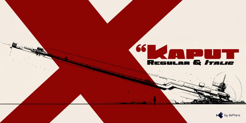
Таблица символов
Для просмотра различных таблиц символов, содержащихся в этом шрифте, пожалуйста, используйте раскрывающееся меню.

Основная информация о шрифте
О авторских правах
Copyright (c) 2024 by deFharo. All rights reserved.
Шрифтовая семья
Kaput Black Black
Шрифтовая подсемья
Regular
Уникальная подсемейная идентификация
Version 2.244;DFHA;KaputBlack;2024;FL842
Полное имя шрифта
Kaput Black
Имя настольной версии
Version 2.244
Имя поскрипт шрифта
KaputBlack
О торговой марке
Kaput Black is a trademark of deFharo.
О производителе
Дизайнер
Описание
Kaput Black, a heavy and unique uppercase typeface family, is here to revolutionize the way we conceive great titles and high-impact visual communication.
Kaput is designed with a perfect balance between strength and sophistication, it is bold, semi-expanded and spectacularly legible, the thick lines and horns with marked contrasts, not only capture attention, but also provide meticulous harmony, thanks also to a thorough work on metrics and kerning.
Available in Black and Black Italic versions, the 20-degree inclination of the italic version adds a touch of dynamism and modernity.
Дополнительная информация о шрифте
Поддерживаемые платформы
ПлатформаКодировка
ЮникодЮникод 2.0 и прогрессивная семантика, только Юникод BMP
MacintoshЛатинская
MicrosoftТолько BMP юникод
Детали шрифта
Создан2024-11-24
Просмотр2
Количество глифов243
Единиц на Em1000
Права внедренияBнедрение ограничено (не разрешено!)
Класс семействаБез засечек
НасыщенностьУльтра-жирный
ШиринаЭкстра-розширенный
Mac стильЖирные
НаправлениеГлифы направленные слева направо + нейтральные
УзорPегулярный
ВысотаНе моноширинный