Lourde Regular
TrueTypeБесплатная
- Ударения (частичные)
- Ударения (полные)
- Евро
lourde.ttf
Теги
Примечание автора
Lourde font by Notamboy captivates the eye with its modern aesthetic, strong presence, and versatile use in all projects. This bold condensed sans serif concept is built on a geometric structure which contributes to the overall impactful visual. Every single letter in this free font has an equal place in the final text regardless of its position.
The undertakings Lourde was built for includes (but are not limited to): advertisements, headlines, titles, branding ideas, logos, and packaging. Websites can also enjoy a touch of modernism with it as well as invitations such as those for business or for personal occasions and parties.
--
The undertakings Lourde was built for includes (but are not limited to): advertisements, headlines, titles, branding ideas, logos, and packaging. Websites can also enjoy a touch of modernism with it as well as invitations such as those for business or for personal occasions and parties.
--
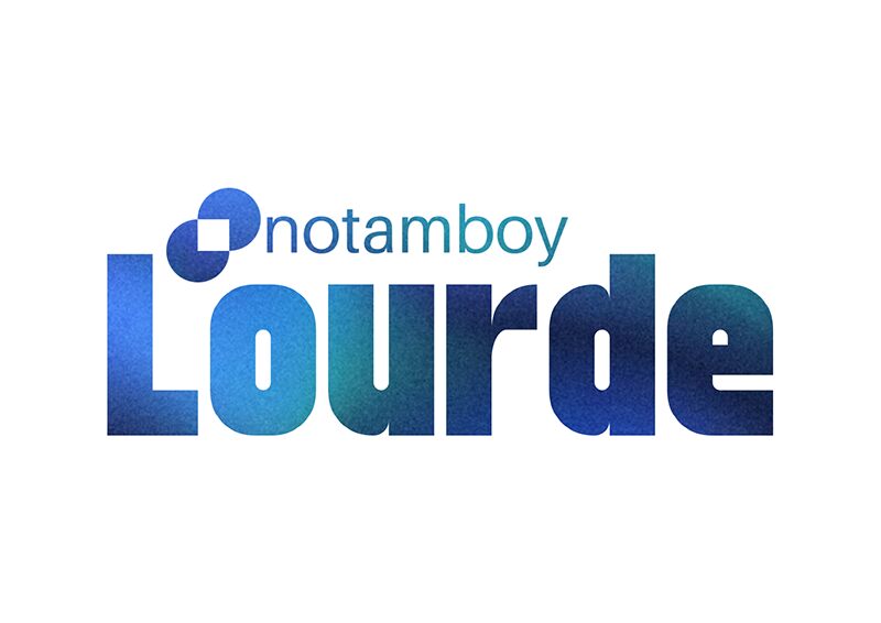
Таблица символов
Для просмотра различных таблиц символов, содержащихся в этом шрифте, пожалуйста, используйте раскрывающееся меню.

Основная информация о шрифте
О авторских правах
Copyright notamboy 2023
Шрифтовая семья
Lourde
Шрифтовая подсемья
Regular
Уникальная подсемейная идентификация
Lourde
Полное имя шрифта
Lourde Regular
Имя настольной версии
Version 1.0
Имя поскрипт шрифта
Lourde
О торговой марке
FontStruct is a trademark of FontStruct.com
О производителе
Дизайнер
Описание
“Lourde” was built with FontStruct
Designer description: This is my first ever font using ideas to make an heavy sans-serif typeface. I was inspired by elmoyenique and Jamie Place (FontBlast). I'm not stealing ideas from anybody by the way, I've wanted to share something to explain a journey of making my own fonts in life.
I got some aspect of making the glyphs look heavier. I've tried to make the letter f, but it flawlessly has the same height as the other glyphs. If I make number four, than I've obviously make it like this because the slanted bricks are not enough to make up a four glyph. Some of the glyphs (for example: ð, ß, ™, ®) are hard to build it because it was considered to be rounded by its curve and too small if the text was heavier.
When I run out of name ideas, the only idea of this font name i've chose is Lourde (french word for heavy).
Дополнительная информация о шрифте
Поддерживаемые платформы
ПлатформаКодировка
ЮникодЮникод 2.0 и прогрессивная семантика, только Юникод BMP
Юникод 2.0 и прогрессивная семантика, Полный асортимент юникодов
MicrosoftТолько BMP юникод
Детали шрифта
Создан2023-08-06
Просмотр1
Количество глифов634
Единиц на Em1024
Права внедренияPазрешено внедрение для предварительного просмотра и печати
Класс семействаБез засечек
НасыщенностьЖирный
ШиринаСжатый
Mac стильЖирные
НаправлениеГлифы направленные слева направо + нейтральные
УзорPегулярный