Novecento slab condensed Normal
OpenTypeБесплатная
- Ударения (частичные)
- Ударения (полные)
- Евро
Novecentoslabcondensed-Normal.otf
Теги
Примечание автора
Novecento Slab Condensed Normal font by synthview is a condensed and modern free serif font. Structured, geometric, with clean lines and a classic serif influence, the font is perfect for users searching for aestheticism and beauty.
Use it to create elegant logos, shop signs, merchandise design such as badges and labels. It will fit nicely also in short paragraphs not limited to magazine articles, poster designs with old vintage touches.
--
Two of the 32 styles from the Novecento Slab font family are available for free for both commercial and non-commercial use, limited to desktop installation only (no webfonts).
By downloading these files, you agree to the End-User License Agreement (EULA) included in the Zip file.
For webfont, ebook, software embedding, or OEM licenses, please visit myFonts or Fontspring.
The complete Novecento Slab family is also accessible through Adobe Fonts and Monotype Fonts.
For a full set and detailed description of font features, please visit https://typography.synthview.com/novecento-slab-font-family.php
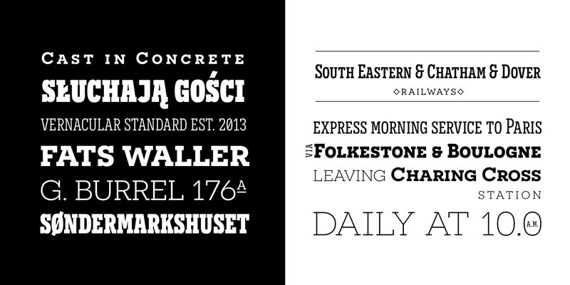
Таблица символов
Для просмотра различных таблиц символов, содержащихся в этом шрифте, пожалуйста, используйте раскрывающееся меню.

Основная информация о шрифте
Шрифтовая семья
Novecento slab condensed Normal
Шрифтовая подсемья
Regular
Уникальная подсемейная идентификация
1.001;SVTD;Novecentoslabcondensed-Normal
Полное имя шрифта
Novecento slab condensed Normal
Имя настольной версии
Version 1.001;PS 001.001;hotconv 1.0.70;makeotf.lib2.5.58329
Имя поскрипт шрифта
Novecentoslabcondensed-Normal
О производителе
Дизайнер
Описание
OVERVIEW:
Novecento Slab is the “slab serif” companion of Novecento Sans, an uppercase + smallcaps font family inspired on european typographic tendencies between the second half of 19th century and first half of the 20th.
As the excellent French typographer Xavier Dupré said “it seems to have been cast in concrete”. Despite its blocky look, Novecento Slab’s lettershapes are optically corrected and balanced.
This font face is designed to be used mostly for headlines, visual identities or short sentences, both in big and small sizes.
Novecento Slab family was spaced and kerned with love and patience; each font has between 750 and 950 group kerning pairs.
This font is available for licensing in opentype and webfont format, as well as for mobile apps, ebooks and for software embedding.
OPENTYPE FEATURES:
AALT
Accesses All Alternate glyphs from the Glyphs panels in Adobe Illustrator or Indesign.
CASE
Sets All-Caps to activate case sensitive forms: transform lowercase letters, figures and some extra signs to Uppercase; vertically aligns math symbols and punctuation.
DNOM & NUMR
Transforms 0 to 9 figures into numerators (aligned to cap height) and denominators (aligned to baseline).
FRAC
Custom fractions generation feature.
SUPS
Transforms 0 to 9 figures into superiors.
LOCL
Romanian, Moldavian and Polish advanced diacritics support; automatic Catalan punt volant; Dutch localization for accented ij; localization for Turkish i (works also for Kazakh, Tatar, Crimean Tatar, Azeri. Just select your text language to activate the localized accents)
CALT
detects German ß in an uppercase string and substitute it with its uppercase version/
SS01 / SALT
Alternate Q letter shape for ultra narrow line heights.
Implemented both as Stylistic Set n°1 (ss01) and Stylistic Alternate (salt) to maximize compatibility between applications.
SS02 / SALT
Alternate N letter shape. Implemented both as Stylistic Set n°2 (ss02) and Stylistic Alternate (salt) to maximize compatibility between applications.
SS03 / SALT
Alternate I letter shape. Implemented both as Stylistic Set n°3 (ss03) and Stylistic Alternate (salt) to maximize compatibility between applications.
SS04 / SALT
Alternate J letter shape. Implemented both as Stylistic Set n°4 (ss04) and Stylistic Alternate (salt) to maximize compatibility between applications.
SS05 / SALT
Alternate Y letter shape. Implemented both as Stylistic Set n°5 (ss05) and Stylistic Alternate (salt) to maximize compatibility between applications.
LNUM/ONUM
Lining / oldstyle figures; LNUM transforms numbers and monetary symbols in Uppercase; ONUM do the opposite (default figures are ONUM).
TNUM / PNUM
Tabular/ proportional figures. Figures (numbers, monetary and math symbols) of same width always align, in spite of their weight.
ZERO / SALT
Slashed zero alternate glyph. Works with tabular and proportional figures, numerators, denominators and superiors. Implemented both as Zero as Salt to maximize compatibility between applications.
Дополнительная информация о шрифте
Поддерживаемые платформы
ПлатформаКодировка
ЮникодЮникод 2.0 и прогрессивная семантика, только Юникод BMP
MacintoshЛатинская
MicrosoftТолько BMP юникод
Детали шрифта
Создан2013-10-07
Просмотр1
Количество глифов371
Единиц на Em1000
Права внедренияPазрешено внедрение для редактирования
Класс семействаБрусковые засечки
НасыщенностьПолу-светлый
ШиринаСжатый
Mac стильЖирные
НаправлениеГлифы направленные слева направо + нейтральные
УзорPегулярный
Пакет содержит 2 нижеуказанных шрифта(ов):
Novecentoslabcondensed-Normal.otf
Novecentoslabwide-Normal.otf
Novecentoslabwide-Normal.otf
Novecento slab wide Normal
OpenTypeБесплатная