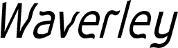
Waverley Bold by Keith Bates is a free distorted display font with tall, uneven letters and a deliberately warped silhouette. Broad strokes swell and pinch as they move through the forms, producing soft bends, sudden angles, and an offbeat hand-cut quality.
A music poster is a good setting for this restless lettering, with album artwork and event graphics close behind. Its irregular shapes can echo collage, photocopied textures, or loose illustration rather than behaving like neutral type. It can also give snack packaging or an independent clothing label a quirky, slightly unruly voice. Posters remain its clearest use because the bent forms turn a title into part of the artwork.